
Since rolling out our groundbreaking SilvaStat360 interactive digital platform in 2017, Forest2Market has continued to develop a series of innovative and analytical solutions for participants in the global forest value chain. The breadth of data available via SilvaStata360 is unparalleled in the industry, and it provides Forest2Market customers with the on-demand data and tools that are most important to their unique business needs.
As we continue to add new features and functionality to the platform, we are pleased to introduce a series of innovative products that are designed to inform and stimulate better decision-making. Included in the new product rollout are Freight Efficiency Analysis and visualizations designed to help consumers of wood fiber better understand their own freight costs, average haul distances, and position in the market.
Accurate delivered price data is essential for consumers of wood raw materials—especially in the current market, which is rapidly evolving to meet new consumer demands. Forest2Market collects delivered price data on every load of wood, which also includes individual cost components:
- Stumpage
- Harvesting/Handling
- Freight to Mill
- Dealer Margin
- Other
Because freight costs can make up 25%+ of delivered wood fiber costs (in most US markets), understanding advantages/disadvantages in regional procurement zones and identifying areas of improvement can result in significant savings and increased profitability. And as energy costs continue to soar, managing these costs will become increasingly important.
Freight Efficiency Visualization
The SilvaStat360 Freight Efficiency Analysis dashboard provides interactive charts that help users visualize the data that correspond to their mill facilities and the larger market. Users can sort by date, product, location and mill, destination type, as well as filter by unit of measure, currency, and other criteria. The data and visualizations can also be downloaded and exported as images to be used in presentation formats.
How does the new visualization work?
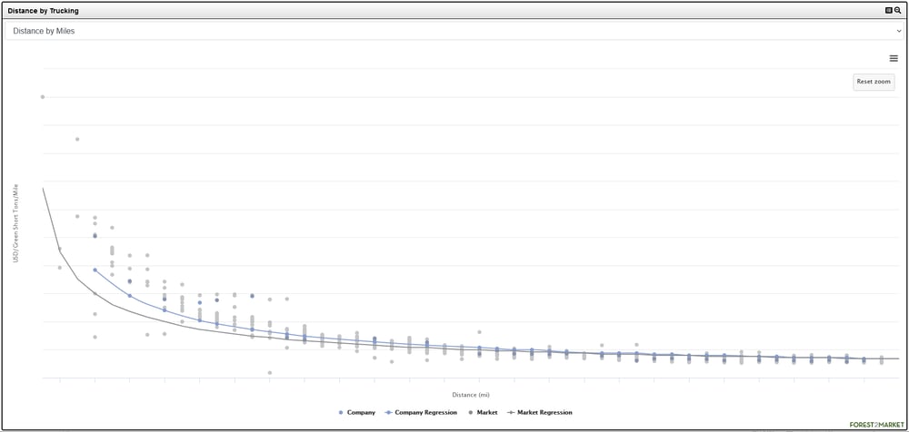
In the screenshot below, we can see freight performance for delivered logs via distance by trucking miles throughout a particular wood basket. Data includes both company/mill and market prices, as well as regression prices for each; the “X” axis displays distance in miles and the “Y” axis displays dollars per ton, per mile. In the particular analysis below, each grey dot represents an actual market freight price per ton by mile, and each blue dot represents the same data for the individual company. Per the trends that are made evident by the visualization, we can see that the company is paying more per ton, per mile than the market for deliveries that are closer to the mill. But for deliveries that are farther away from the mill, the company is in line with or outperforming the market.
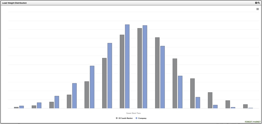
In the second visualization, we can see freight performance for delivered logs by load weight. As in the visualization above, this view includes both company/mill and market data and in the particular analysis below, each bar represents the company or the market load weight distribution by tons. Per the trends that are made evident by the visualization, we can see that the company receives more loads than the market in the lower green short ton (GST) range, and fewer loads than the market in the higher GST range.
What can the data above tell us about this particular mill’s freight efficiencies?
- This mill has room for improvement, especially on deliveries that originate close to the mill—as illustrated in the top chart. Understanding market freight rates for specific mileages could translate into significant savings. Even $0.01 per ton per mile savings on an average 50-mile haul translates into a savings of $0.50 per ton. When multiplied across all tons purchased at the mill, the savings start to add up quickly.
- The mill is also disadvantaged when it comes to load weight distribution, as the bar graph demonstrates that the facility underperforms the market in maximizing payload. This mill needs to discover why it has lower than average payloads and what actions can be taken to increase payload while maintaining legal weights. If the mill could shift more deliveries to trucks with a higher payload, the change could result in eliminating the freight expense and carbon footprint of additional trucks.
For example, if this mill increased average haul payload by just one ton (on an average 25-ton truck), it could eliminate the need for one truck every 25 loads. This would result in increased mill efficiency and savings while decreasing the mill’s carbon footprint.
With the new Freight Efficiency Analysis, Forest2Market subscribers can better compare their company-wide and individual mill delivered freight costs to the market by filtering data to fit their unique profile. This increases transparency and allows customers to better identify areas where they can improve procurement strategies that will drive profitability.